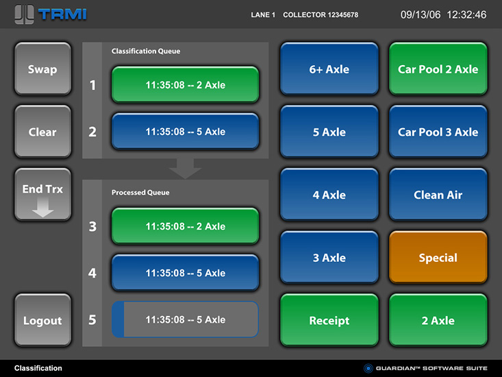
Toll Terminal Touch Screens
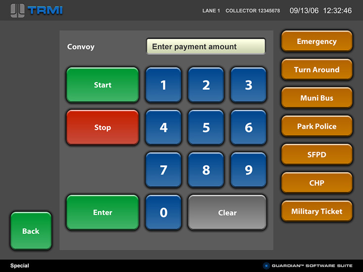
The client for this project wanted to improve on the default software development toolkit color schemes and clip-art that they had been using and selling to toll collection agencies. They had a vision for a “man-machine-interface” that would look better than every other product in the category and would actually help sell the products to new toll systems customers.
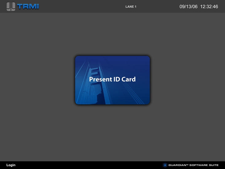
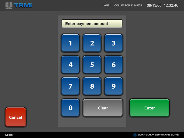
“I expected the help with colors and button graphics,” said the project manager, “I did not expect the ergonomics and usability help.” The screens needed not only typical elements like a login dialog and numeric entry keypad, but also a complex scrolling vehicle transaction history.
Contact us. We would enjoy discussing how our UXD can make your software work smarter.

