“Our customer loved the look”
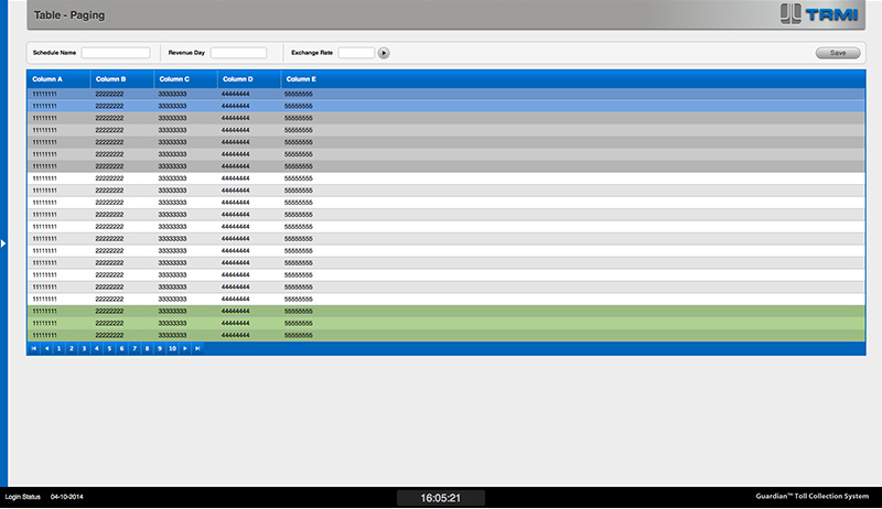
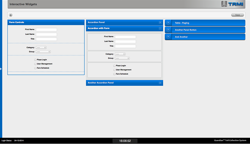
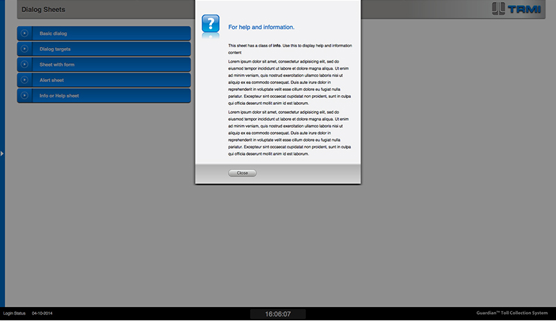
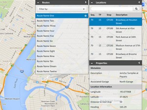
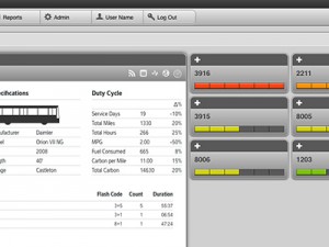
On every screen, only the relevant information is displayed, and at each state inactive buttons are grayed-out, making it very simple for a new user to learn the system. “Our customer loved the look,” said the Project Manager. “And the usability saved us money on testing and training. The client agency showed the interface to a representative of another toll agency who immediately said he wanted to purchase the system.”
